This project, based on the Google Ventures design sprint process, was prompted by Bitesize UX with the challenge of enhancing the art viewing experience in museums or galleries.
The goal is to increase customer satisfaction by improving the in-person viewing experience.
Picture this: you've got limited time and haven't done any research before visiting a museum. How do you gain insights from the artworks?

Imagine your closet is a mess. The quickest way to know what's inside is to sort everything into different categories.
So I utilized affinity mapping to organize and analyze data, and employed empathy mapping to delve deeper into the user's perspective.
Here is what I discovered:
Museum visitors often prefer independent exploration and seek efficient ways to gain a deeper understanding of artists or artworks without sifting through lengthy information.

How can we make it easier for museum visitors to gain insights efficiently and independently?
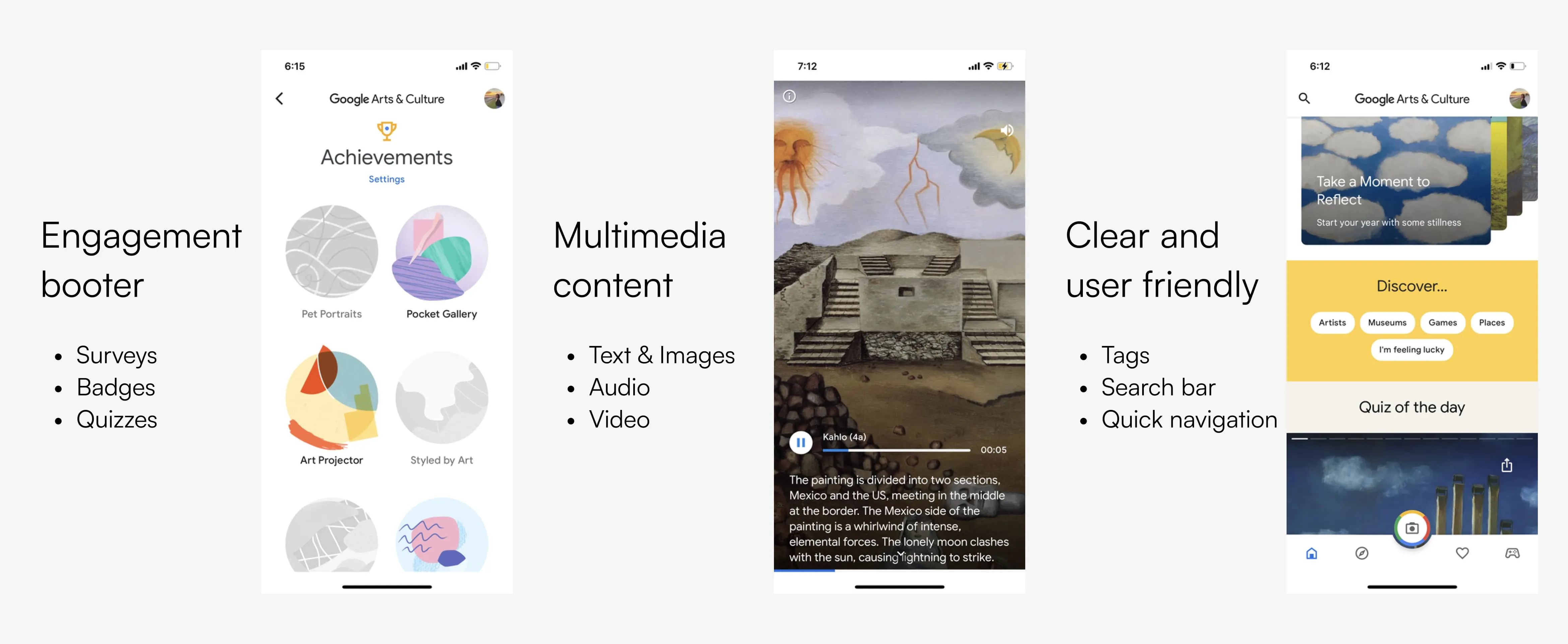
To address this question, I looked to Google Arts and Culture as part of my lighting practice for inspiration. My goal is researching online for at least 3 fun features in existing museum apps within 1 hour.
Here is what I discovered:
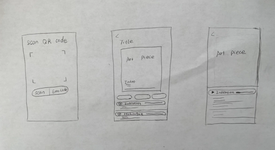
I set an 8-minute timer and did Crazy 8s to quickly come up with different variations of the most critical screen which is the art piece detail screen.
What do users want? I ask myself.
Based on the previous findings, quick navigation, concise and insightful information, and multimedia content offering diverse interactions are the way to go.
With the goal becoming clearer, it's time to choose the best solution.
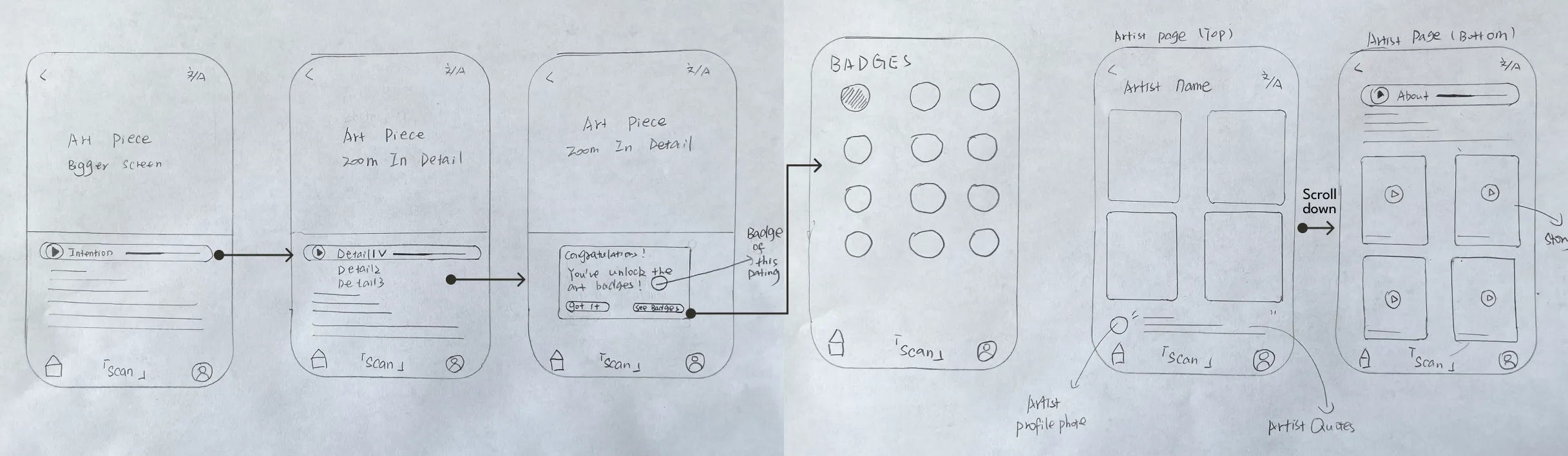
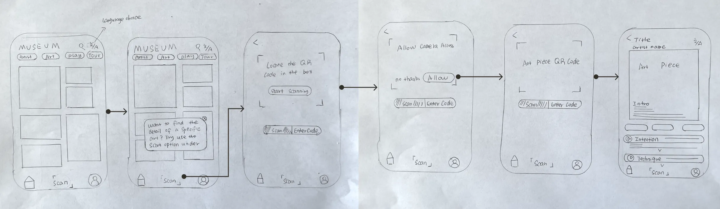
Utilizing the well-known technology of QR codes, users can swiftly reach their desired destination with a simple scan using their phone.
Each QR code corresponds to a specific item, allowing users the freedom to choose which artwork or artist they want to explore further.
With the objective of discovering the artist and the art piece in mind, I create an end-to-end user flow storyboard to visualizing the steps of user’s interaction with the product.
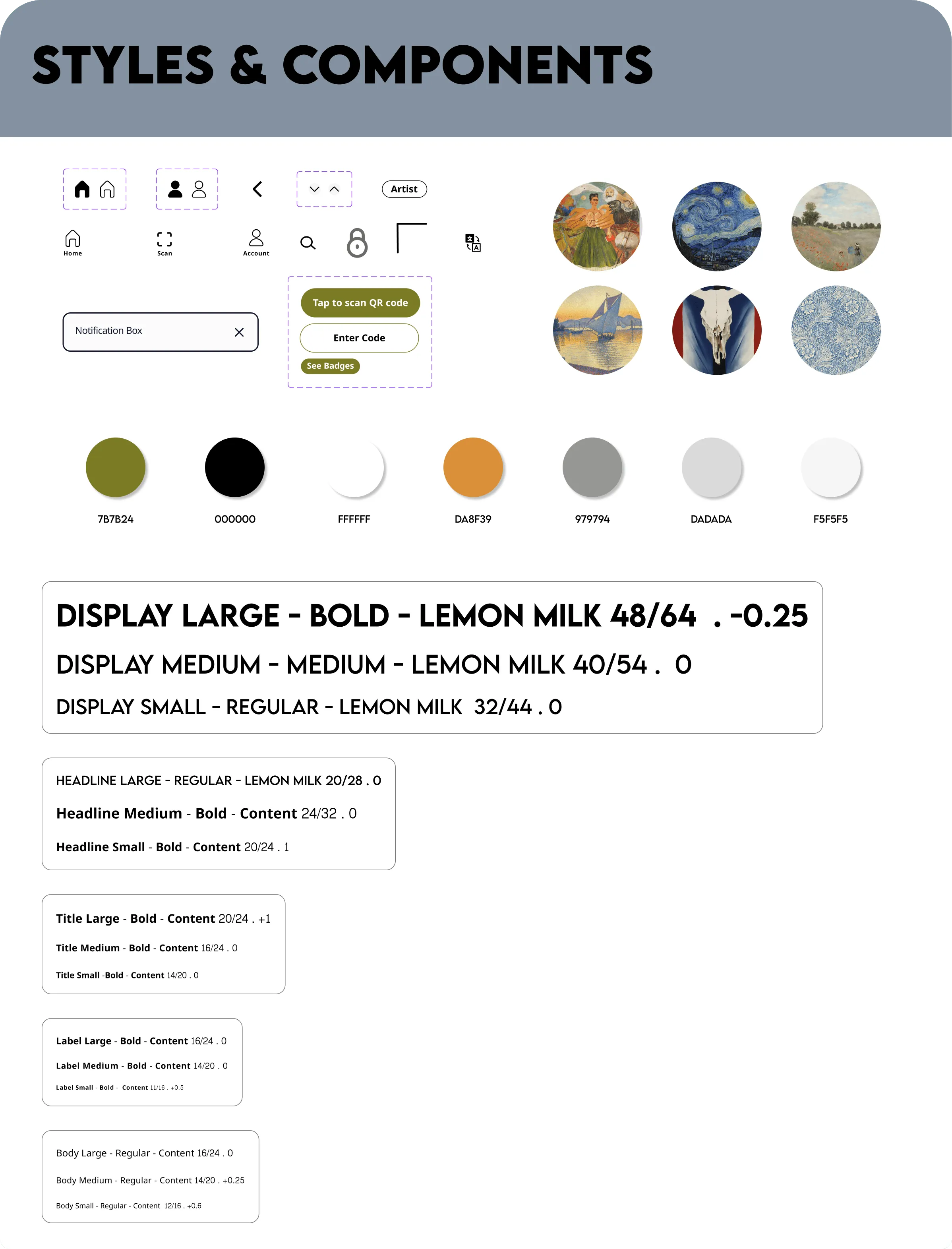
As the storyboard provided a detailed wireframe, the next step before constructing the prototype was to establish a style guide.
Gallery Pal is a mobile application designed for visitors seeking an immersive museum experience. It aims to replicate the ambiance of a real museum, offering a digital interface that feels artsy, modern, and welcoming.
That's why Lemon Milk font and content font were ideal selections for the application.
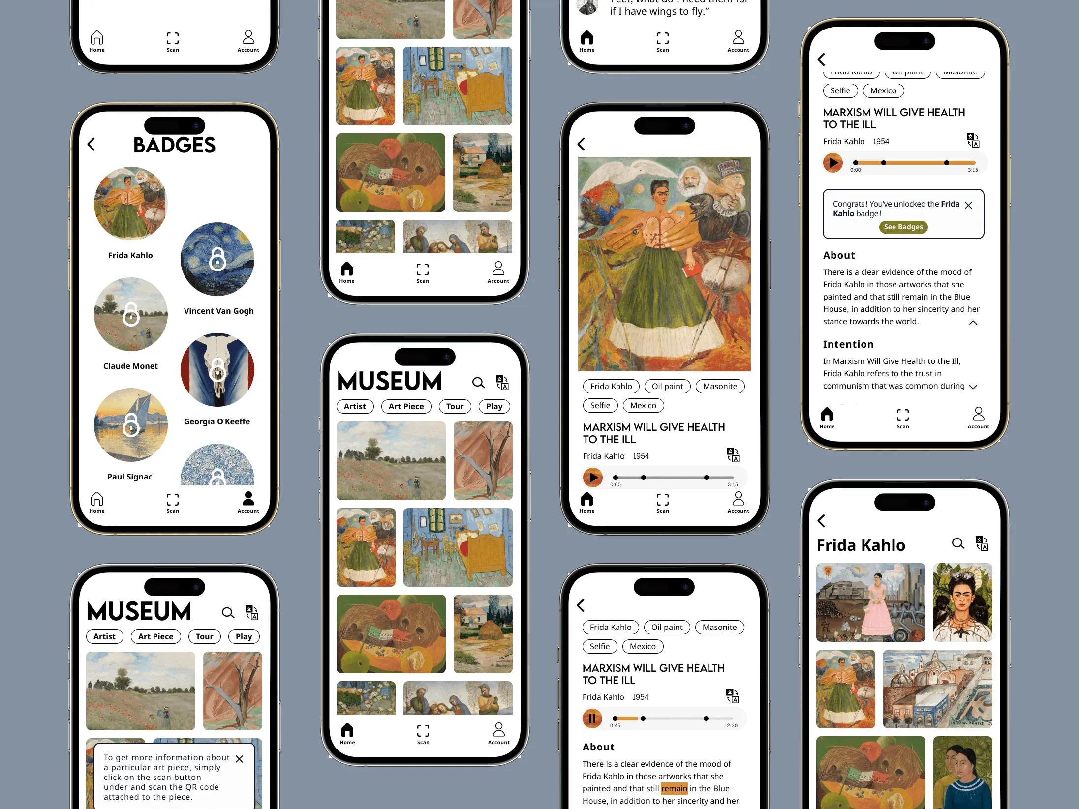
On Day 5, which also marks the final day of the entire design sprint process, usability testing took place. I conducted tests with five different participants who met our target user criteria by assigning them specific tasks.
While there are parts that work as fluent, there some aren’t.
• Users would love to have the ability to save the art
• See badges information box is not noticeable
Through my first design sprint, I was amazed by how efficient 5 days can be in making significant improvements. The process was both challenging and rewarding.
Along the way, I learned a few valuable lessons that I will carry with me in future design sprints.
• Rough sketch is good enough
• Prioritizing the main user flow
• Aware time management