Vitalicious is a mobile application aims to improve users with multiple chronic conditions or food restrictions health outcomes.
In 2022, my dad spent a long time in the hospital due to surgery, and at the same time, his diet had to change. Due to his multiple chronic conditions, we found it was really challenging to find the right ingredients for his special diet.This inspired me to find solutions for this common issue.
Finding recipes that cater to people who has restricted diet, especially with multiple chronic conditions, can be challenging.
As someone with a family member facing challenges due to their restricted diet, I aim to understand the size of the community potentially experiencing similar struggles.
My secondary research shows that 1 out of 4 Americans have Multiple Chronic Condition (MCC) and for persons 65 and older 3 out of 4 have MCCs. Surprisingly, there's a lack of diet plan applications available to help individuals managing MCC.
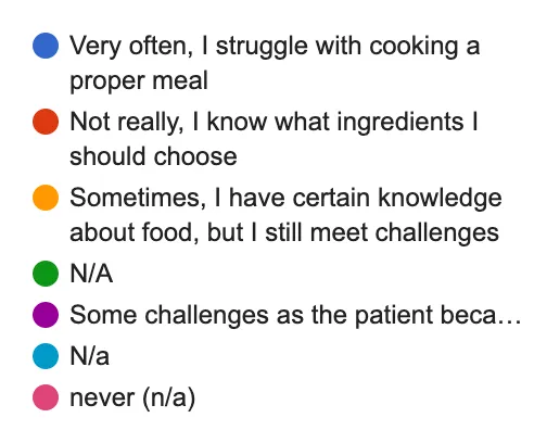
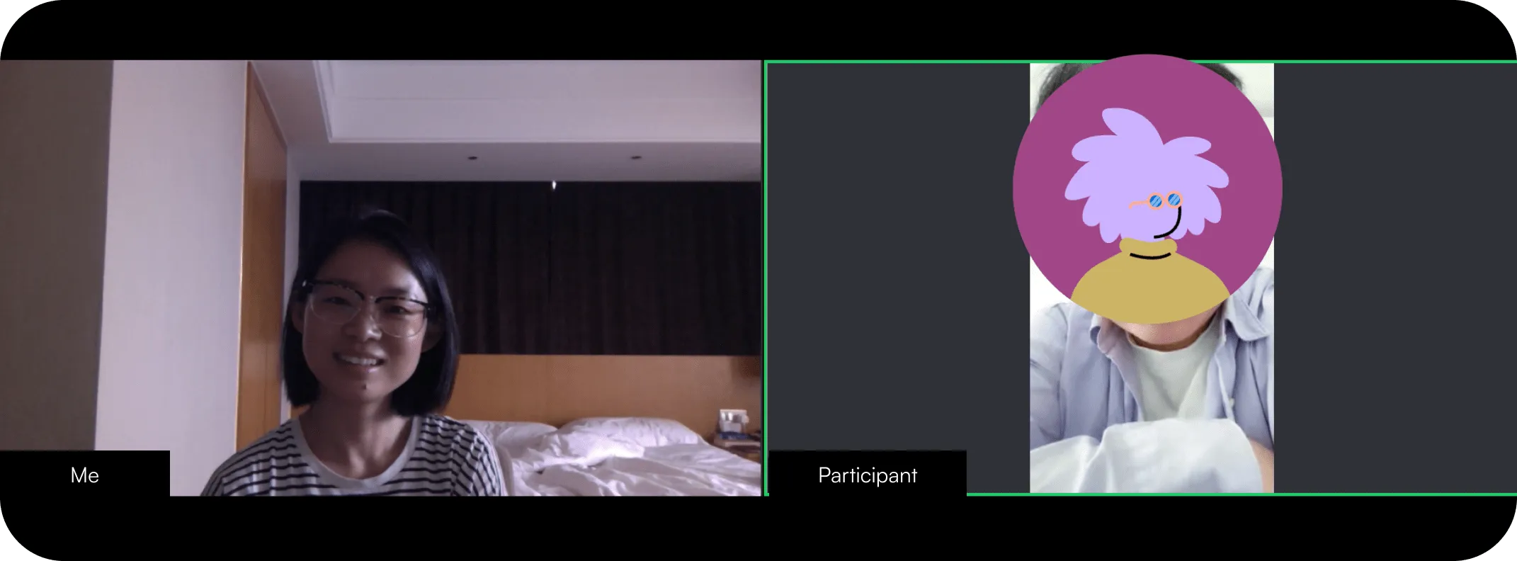
To gain a deeper understanding, I created a screener survey to identify five suitable participants who are struggling to manage their diet due to specific health conditions for interviews.
During one interview, a participant met all the criteria indicating health-related diet challenges. However, it turned out her hospital stay was due to childbirth, and her dietary restrictions stemmed from religious vegetarianism.
This insight suggested the app's user groups could be broader than initially anticipated.
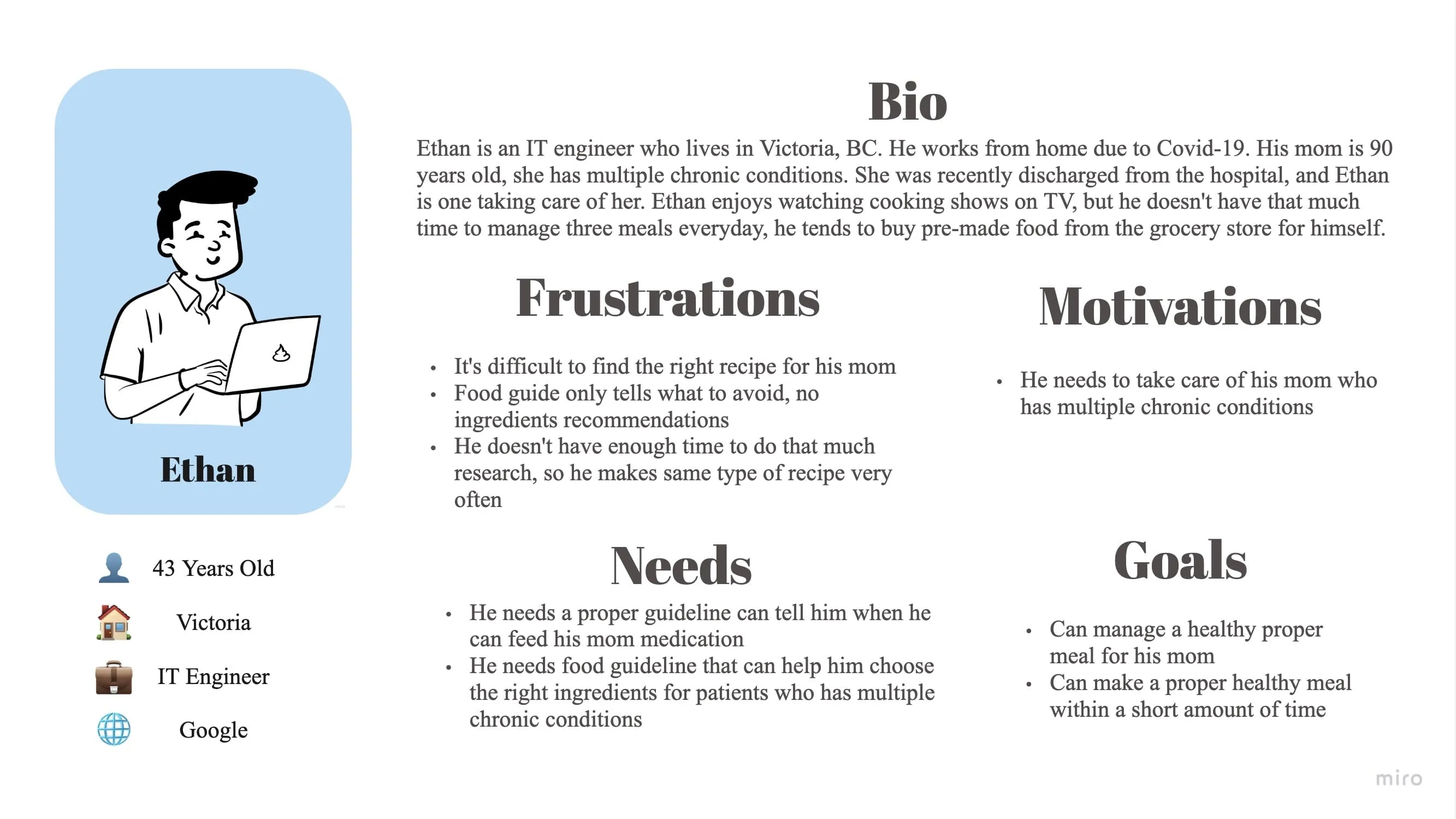
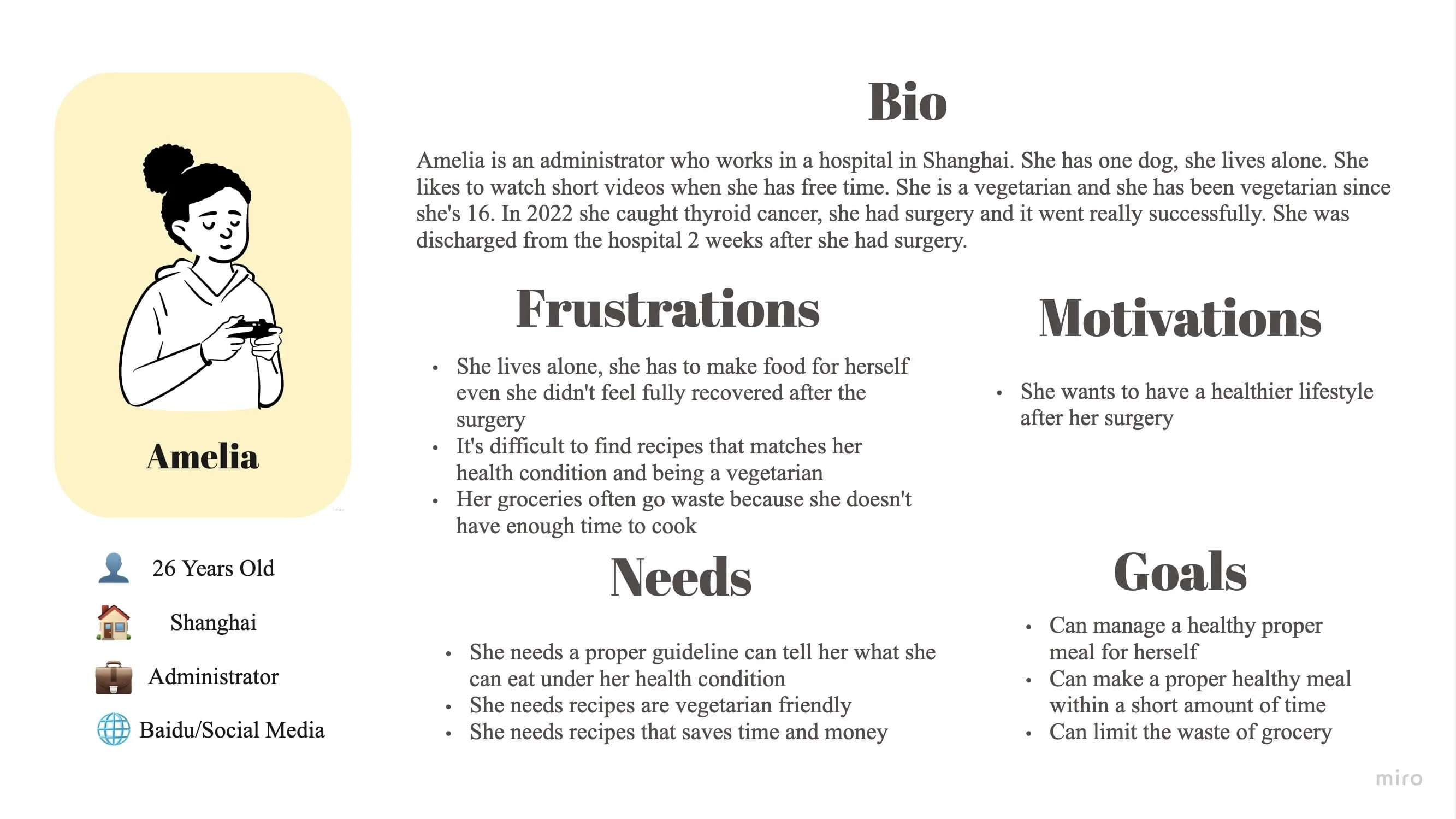
After collecting a massive amount of data, I used affinity diagramming method to organize it and identified two potential user groups facing the same challenge.
Here are the insights:
• Two user groups: those with health-related or personal dietary restrictions, and their family caregivers.
• Food guide they received from the hospital is too generic
• Time & Price matters for the recipe
• They trust doctors or nutritionist's suggestion
• They are happy to find replacement
Based on previous findings, the question being asked is: "How can we deliver accurate food guide recommendations that save users time and money, while also offering personalized suggestions that align with medical or nutritional guidance?"
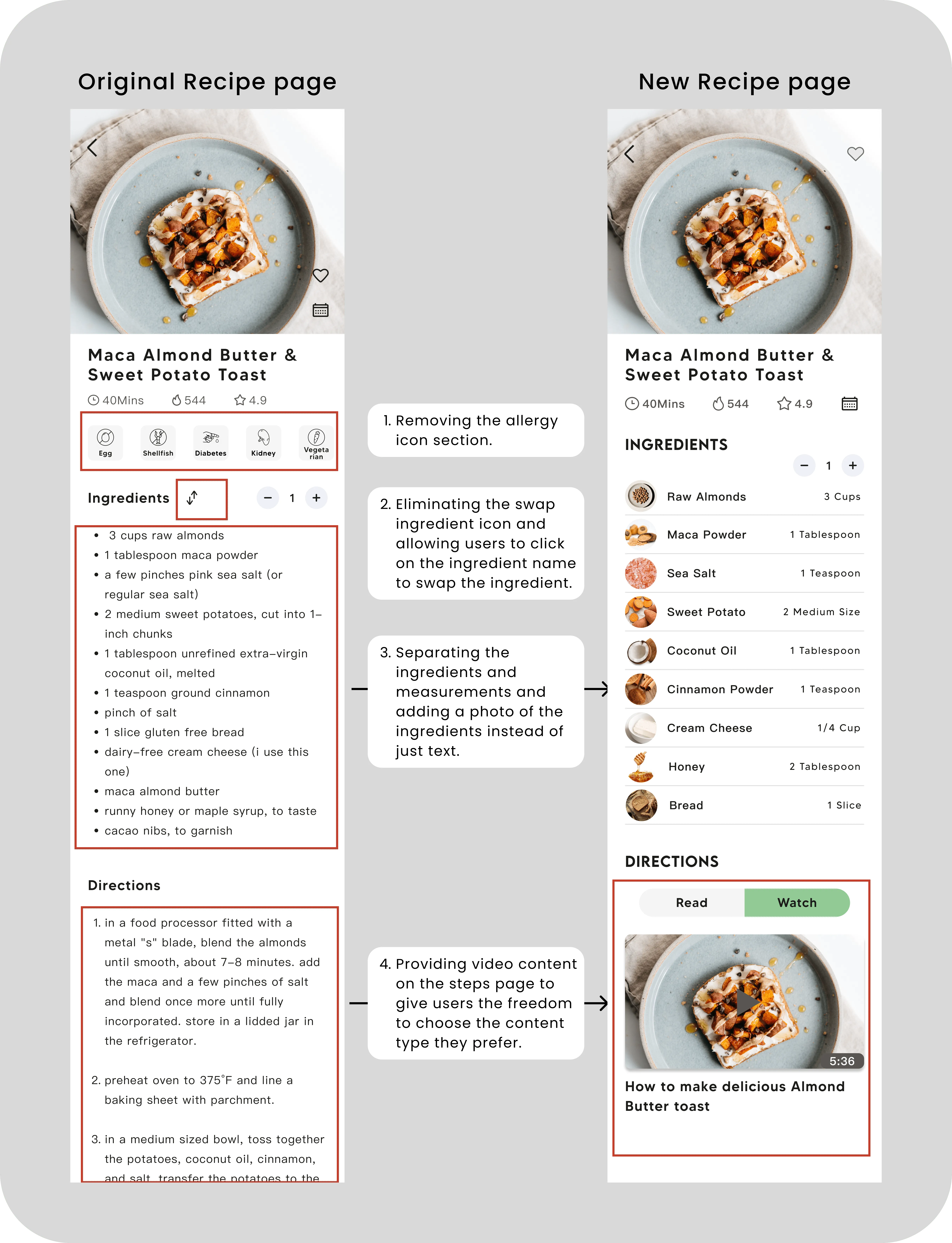
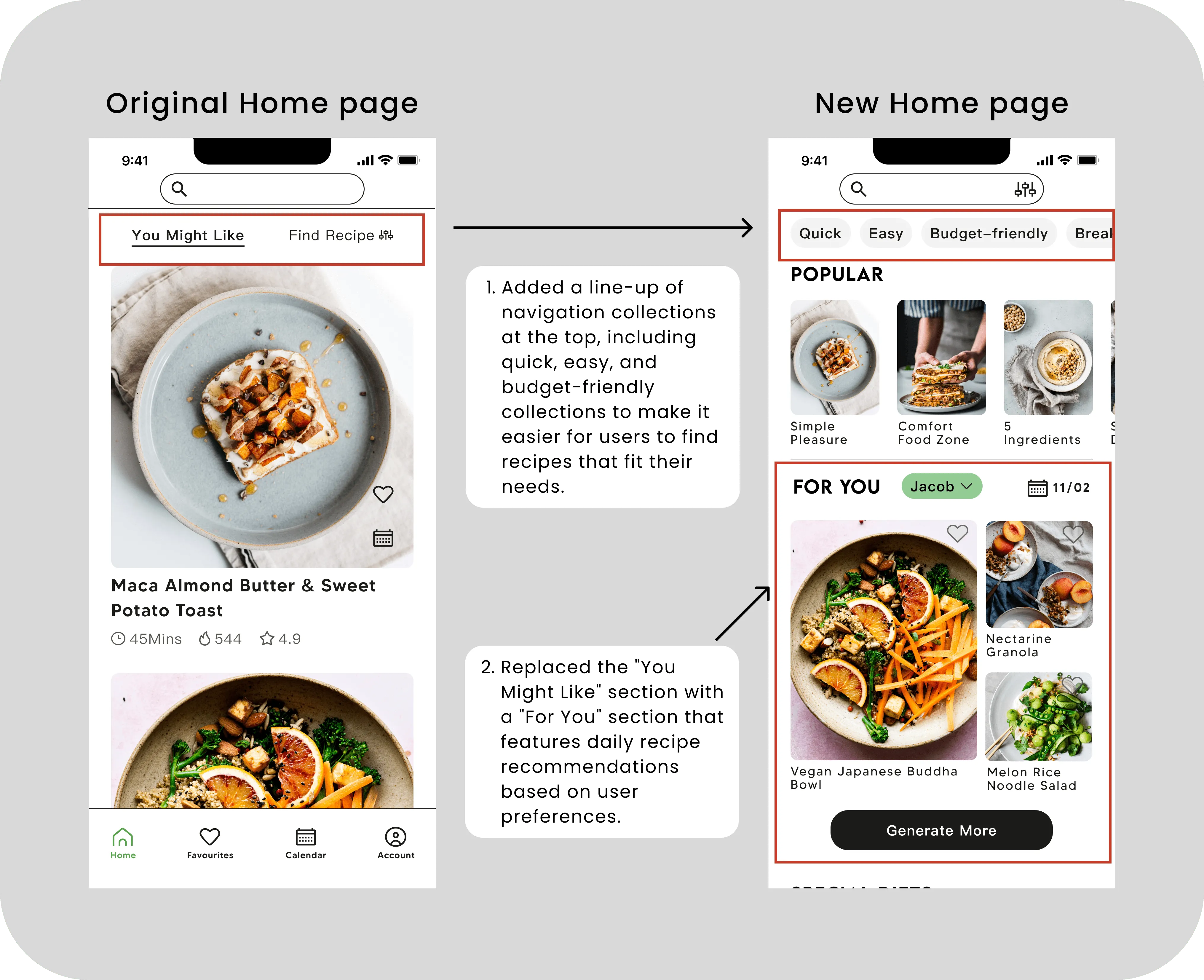
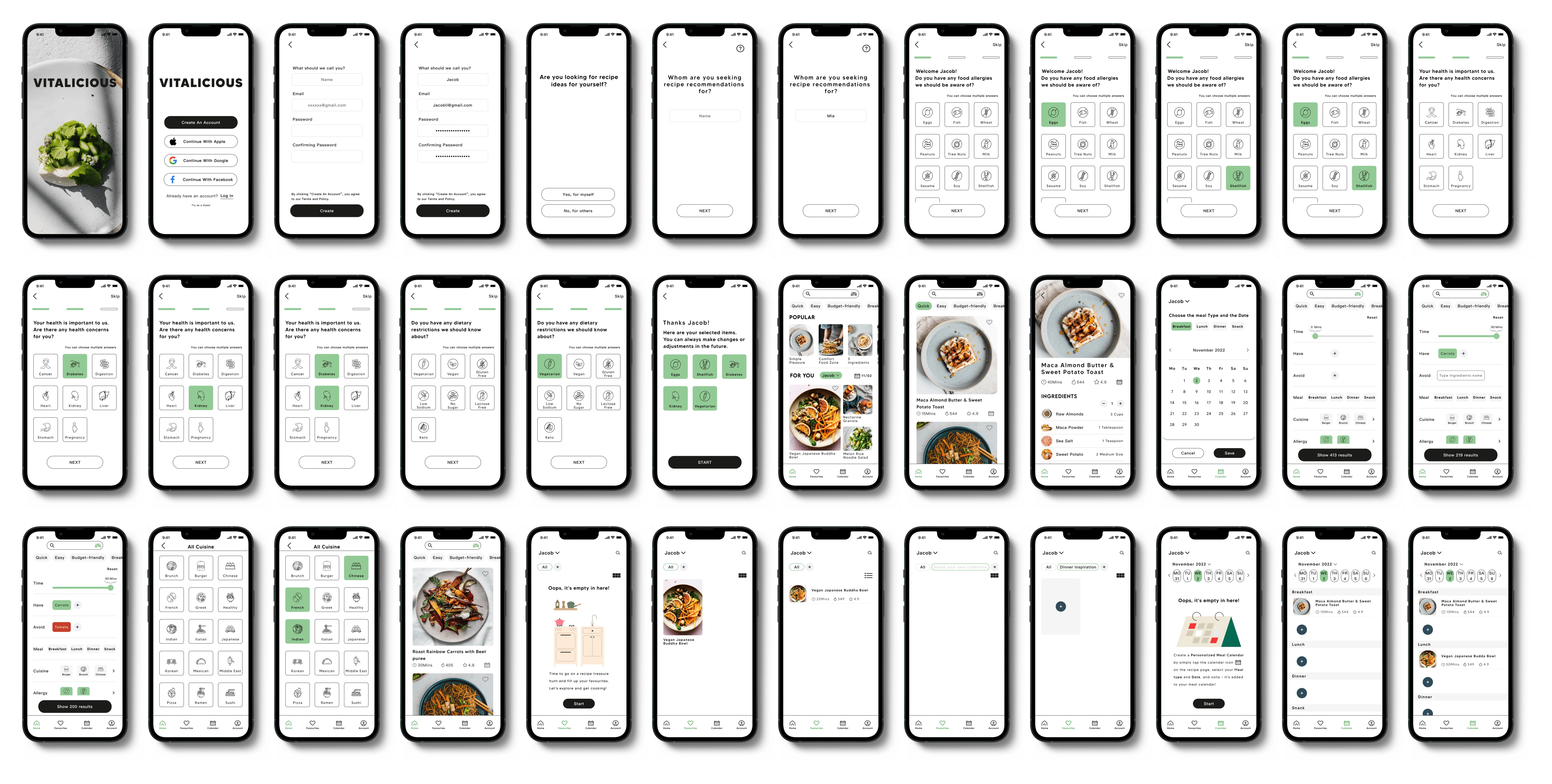
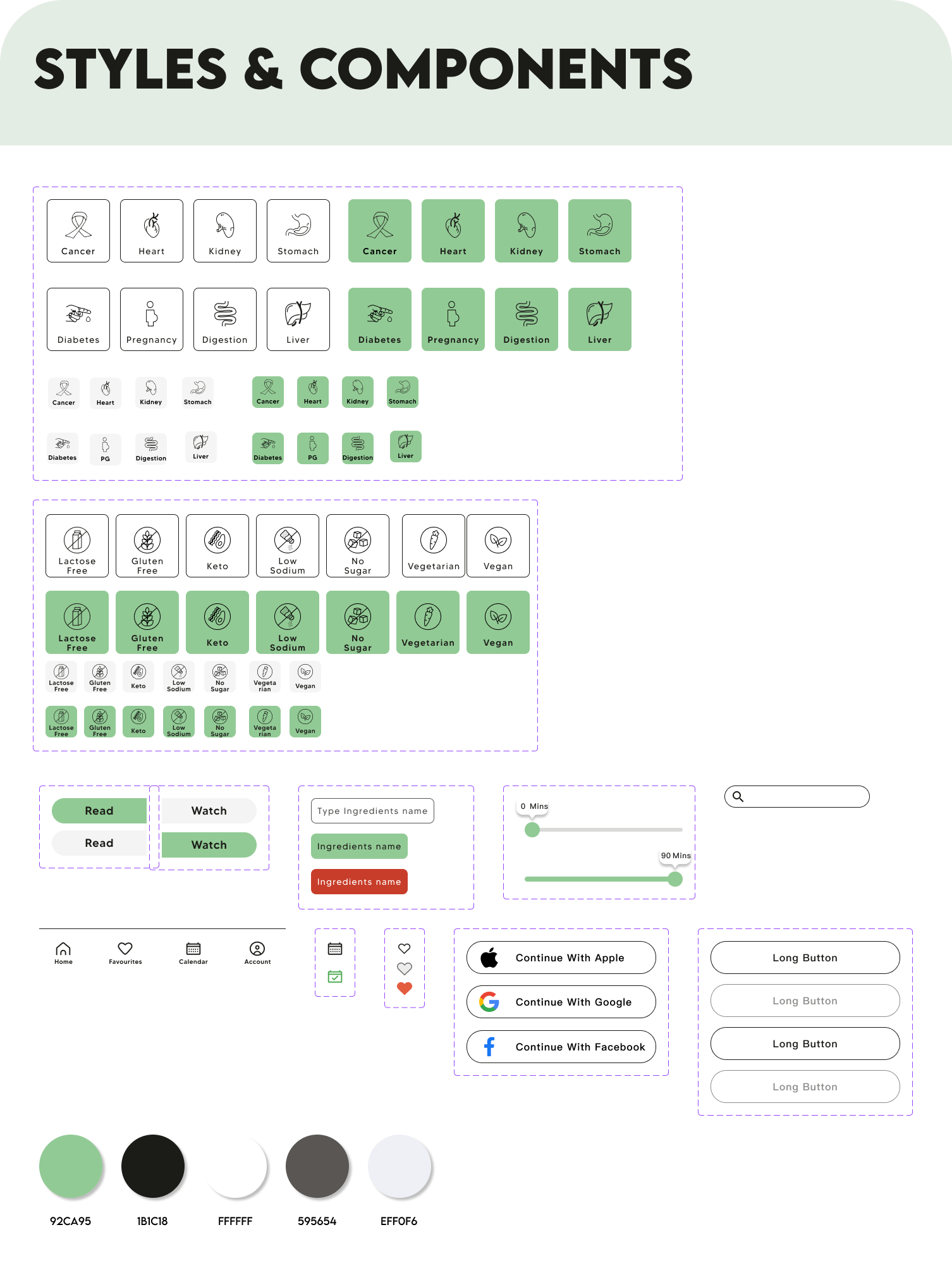
During the creating process, Identifying the user groups became the No.1 challenge for me. After consulting mentors, I decided to add a user group identification question into the signup flow to tackle this problem.
Transitioning from wireframes to high-fidelity design is a complex journey. As this is my first mobile application design, I've learned a lot along the way. For instance, I learned that the toolbox isn't the best choice for mobile applications because there's no hover effect like on desktop.
Vitalicious embodies values of care, health, and trustworthiness. I selected #92CA95 green as the primary color to evoke a calming and refreshing feeling for the brand. To enhance user engagement, I integrated icons into the signup flow questionnaire, making the experience more enjoyable.
To gather genuine user feedback, nothing beats conducting usability testing. I tested the prototype with six users to gather insights on the design.
Here are some adjustments I've made based on the testing: